How to create a simple decision dashboard in Tableau Public
There are many excellent ways to create interactive decision dashboards. I chose Tableau for last week’s illustration because I had already created the dashboard as part of an earlier project, it is a format that is easy to distribute over the Internet, and the Tableau Public site has a lot of information and examples of interesting data visualizations.
To follow last week’s dashboard demonstration, I thought it would make sense to illustrate how to create one. Unfortunately I couldn’t replicate what I did several years ago to create last week’s dashboard (I haven’t figured out why), so I had to make a new one. Here is what I did.
Tableau Public illustrations can either be created online or using a downloaded copy of the Tableau Public Software. As far as I can tell, the process is the same. All files created with either method will be saved to the Tableau Public site and potentially available to everyone.
The figure below shows the dashboard I built for this illustration. The online version can be accessed using this link.
The first step is to collect the data that will be used for the dashboard. The simplest way to do this is to add the data to a spreadsheet that is then saved as an Excel file. This can be done with many programs including Excel, Google Sheets, Open Office, and Apple Numbers. Here is a copy of the data I used to build the sample dashboard, using a file created in Google Sheets and subsequently downloaded as an Excel file:
Note that the Uncertainty Range field is not used in the final dashboard, but I think it is helpful to include it with the dashboard data.
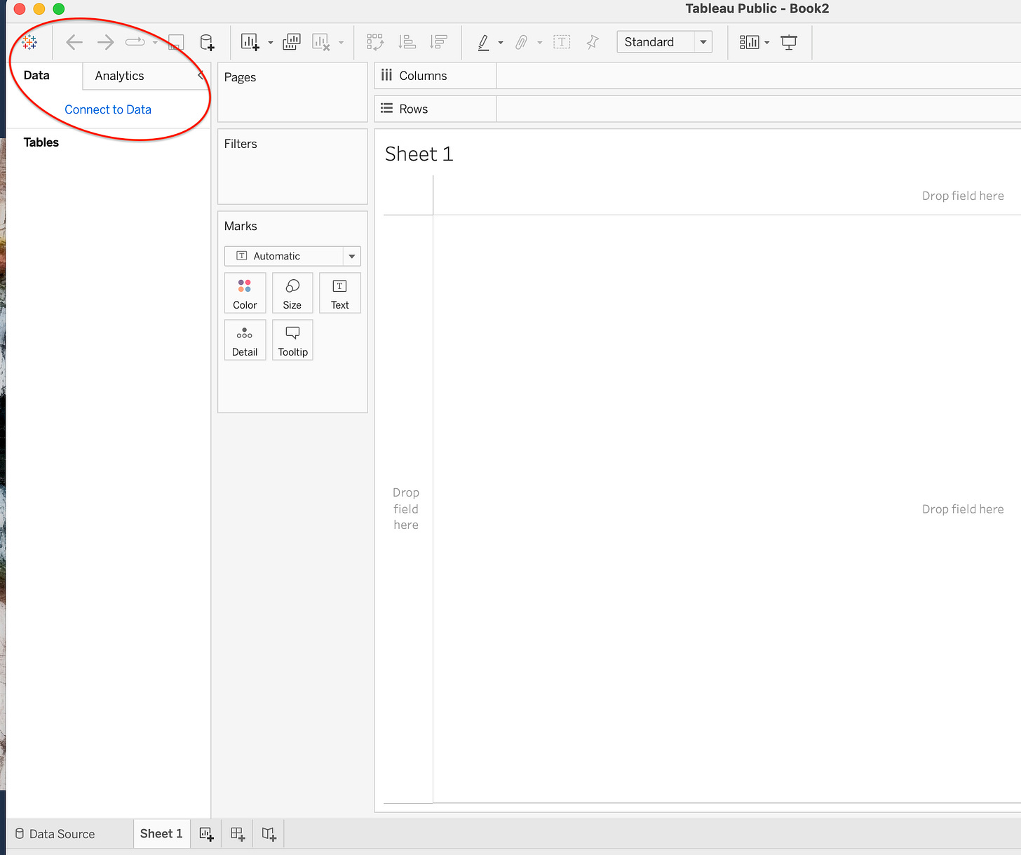
The next step was to open a new file in Tableau Public and connect the dashboard data file. Just click on the “Connect to Data” link and follow the instructions.
Once the data were uploaded, I created a chart for the outcome Effectiveness as follows. (Note that “Sheet 1” opens by default):
◦ Move Option to the columns shelf, and the value low_range_value to the row shelf.
◦ Move Outcome to the Filter area, select Effectiveness.
◦ Add Option to the Filters, right click on it and select show filter. It will appear on the upper right. (This allows one to delete one or both of the options from the display.)
◦ Change the Marks Area to Gantt Bar.
◦ Move Option to the Color box.
◦ Move range_value to the Size box.
◦ Right click on the Y axis, change it to fixed, 0 to 100; and the title to “Percent Effectiveness”.
◦ Right-Click on the “Sheet 1” tab at the bottom and rename “Effectiveness”.
The result of these steps is shown below:
The next step was to duplicate this process for the other two outcomes. It is easy. Just right-click on the “Effectiveness” tab and select duplicate. Switch to the new tab and rename it “Side effects”; then uncheck Effectiveness and check Side effects in the Outcome filter on the right side of the display. Once done, repeat the process for Cost.
The last step is to create the dashboard. Select new dashboard from the Dashboard tab at the top of the display. Next:
- Select automatic in the Size option box.
- Drag the 3 sheets into the display area.
- Adjust their sizes so they are equal.
- Click on the Effectiveness area, mark “Use as filter” in the upper right.
- Click on the Outcome and Option filters, go to other options and select “remove from dashboard”.
The result is the dashboard shown in the first figure above.
Musings
If this tutorial illustration was helpful, please let me know in the comments. Also, feel free to post any questions there and I will do my best to answer them.


